Source
Source: die neue linie, March 1935. Cover.
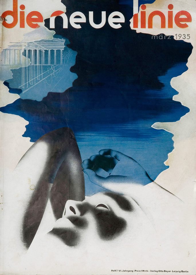
Neue Linie was a German lifestyle magazine that first appeared in 1929 and promoted modern design, alongside features on travel, technology and architecture. The magazine brought together trends in these fields from around the world, giving it an extremely international flavor, one it aimed at fashion-conscious and wealthy German men and women. A key feature of the magazine was its use of a Bauhaus aesthetic, from its use of lowercase letters and sans serif font in the title here, to the layouts and color palettes on both the cover and within. Its design was striking to readers when it first arrived on newsstands, as it represented a dramatic shift away from the typical forms found in most magazines. Neue Linie became especially recognized for its unique cover designs, which frequently featured the work of Bauhaus artist Herbert Bayer (1900–1985). Bayer had previously worked at Vogue magazine, and he developed a crisp visual style, which featured the mixing of lower- and upper-case letters in his typefaces. After 1933, despite the Nazis’ abhorrence of Bauhaus design and the far-reaching effects of the Gleichschaltung, the magazine remained in publication. While there was a shift over time to more national themes, some of the artwork—including its iconic covers—reflected the continued interest in modern design in Nazi Germany. In 1937, some of Herbert Bayer’s work was included in the Nazi “Degenerate Art” exhibition, and Bayer eventually immigrated to New York in 1938, and continued to move around the United States thereafter. The relative longevity of Neue Linie reminds historians that, despite high-profile attacks on “degenerate art,” and “cosmopolitanism/internationalism” in art and design, the influence of German modernism never fully disappeared in Nazi Germany.
Source: die neue linie, March 1935. Cover.